Environmental Science is one if Australia’s leading research areas. It is a field with Australia’s highest representation of highly-cited authors. And for all the foibles of the Excellence in Research for Australia (ERA) ratings, it is the field with the most universities “well above world standard” (ERA 2018).
Australia’s environment is clearly important – to things like our national identity, our health and wellbeing, and some of our main industries (e.g., agriculture, tourism). The state of Australia’s environment, however, is poor.
“Environmental change” is also recognised as a national “Science and Research Priority” by the Australian government.
So given that background, you might expect that the Australian Research Council (ARC) would prioritize funding for Environmental Science.
Of the 100 ARC Future Fellowships recently awarded, only one was in the area of Environmental Science (congratulations to Vanessa Adams – excellent stuff). This is no anomaly. In the last 5 years, out of more than 500 Future Fellowships awarded, only 12 have been in the area of Environmental Science.
Plot the number of Future Fellowships versus the number of universities judged to be “well-above world standard” and there are some clear outliers.
The number of ARC Future Fellowships awarded in different disciplines between 2018 and 2022 versus the number of Australian universities judged to be well above world (ERA 2018).
On the positive side, Engineering seems to be getting a very large share of the Fellowships. The reason for this is unclear, but it seems to be an ARC priority.
Biological Sciences also might seem disproportionately over-represented. Countering that view, Medical and Health Sciences is very much lower. The latter is expected since the ARC does not fund “medical research”, so many of Australia’s large population of top medical researchers are likely applying for (and being awarded) Future Fellowships in areas of Biological Sciences.
Mathematical Sciences and Agricultural and Veterinary Sciences are also somewhat under-represented.
But the biggest outlier? Environmental Sciences. Twenty one Australian universities were rated as being well above world standard in 2018 by the ARC, yet this field has only received 12 Future Fellowships in the 5 years since then. I have no idea why, but it seems very odd.
With a few days to go until ballots begin to be counted in the 2022 Australian federal election, I thought I’d give an overview of some of the things I’ll be tracking on Saturday once counting starts. In addition to watching Antony Green on the ABC and keeping an eye on Kevin Bonham’s twitter feed and blog, I’ll be watching the AEC website and its booth-by-booth data. Here’s why…
My interest in analysing election results was born in the contest between Sophie Mirabella and Cathy McGowan in Indi in 2013. Cathy McGowan would have been described as a “teal” candidate in today’s terms, even though her campaign brand was orange. McGowan presented as an economically conservative yet socially progressive candidate in a similar way to today’s teal candidates.
Here are the things to keep an eye on:
The overall margin that the sitting member had at the last election based on the two-candidate-preferred vote.
First preferences, particularly swings on a booth-by-booth basis.
Flows of preferences, leading to two-candidate preferred votes, and the swing of that.
The current Australian Treasurer’s seat of Kooyong is a good example. Let’s look at that seat, where Josh Frydenberg is facing a challenge from the teal candidate Monique Ryan.
The 2019 result
Frydenberg won that seat in 2019 with 55.7% of the vote on a two-candidate-preferred basis (2CP). He beat Julian Burnside, a Greens candidate who got 45.3% of the 2CP vote. Therefore, Frydenberg cannot afford to lose 6% of the 2CP vote if he is to retain the seat in 2022.
There are approximately 100,000 voters in Kooyong, so a 6% swing represents about 6000 votes.
In 2019, Frydenberg won 49.4% of first preferences, so he gained a little over 6% on top of his first preference votes once distributing preferences allocated by primary voters of other candidates. In contrast, Burnside won only 21.2% of first preferences, so he more than doubled his vote via the flow of preferences. Preferences matter.
It is interesting to see where the preferences came from. Frydenberg primarily got preferences from voters whose first preferences were Jana Stewart (ALP candidate; 2770 votes), Oliver Yates (an independent; 1793 votes), and Steven D’Elia (United Australia Party (936 votes). He got a little over 700 votes from three other candidates (two independents and an Animal Justice Party candidate).
You might be surprised that Frydenberg got so many preferences from ALP voters. The reason was the number of ALP voters. Jana Stewart won 16666 first-preference votes, and Frydenberg got 16.6% of these via preferences. So he got a relatively small proportion of relatively large number of votes.
Similarly, Oliver Yates netted a healthy number of first-preference votes (8890), but Frydenberg won only a small fraction of those (20.1%). Oliver Yates ran on a platform that very much reflects the current teal mood (a revolt against the direction of the Liberal Party, and demanding stronger climate action).
In contrast, preferences from primary voters for the UAP candidate flowed strongly to Frydenberg (79%).
If we add the first-preferences for the Greens, ALP, and Oliver Yates in 2019, then we have quite a strong block of potential votes for Monique Ryan in 2022 (47%). Clearly, Monique Ryan can’t be sure of winning all those first preference votes from 2019 (either as first preferences or on preferences ahead of Frydenberg). But given she has a chance of also taking some first-preference votes directly from Frydenberg, then Ryan seems clearly in the running.
First preferences in 2022
So I initially will be looking at Frydenberg’s first preference votes in 2022. The 2CP votes are what really matters, but first preference votes are normally reported before the 2CP counts. In 2019, Frydenberg’s first preference vote fell 8% but his 2CP fell by only 6%. But a drop in his first preference vote of around 6-8% in 2022 will worry him.
One key when looking at the swing in votes is to realise that the vote differs between booths. In particularly, pre-poll votes and postal votes have tended to favour Frydenberg in the past. The votes counted on Saturday evening will tend to be the votes from regular booths. So Frydenberg might suffer an apparent swing against him on Saturday evening, but some of that swing will likely be recovered in the following days as more pre-poll and postal votes are counted.
But any swing against him on regular votes will tend to be replicated across booths. You can see that in the 2019 result.
Swing to Frydenberg in the 2019 compared to 2016 for each booth versus the total votes per booth. The negative values are swings against Frydenberg. The only seat with a positive swing was a small “hospital” booth (a team that collects ballots from hospitals). You can see that the swings for the non-ordinary votes (orange circles, including pre-poll, absent and postal votes) were similar to the average overall swing. Once we have swings for 10-15 larger booths, we’ll have a good idea about where the seat is heading.
So, I will be looking at the swings of individual booths. If those swings on first preferences average greater than 6%, then the result becomes interesting. I would guess if the average swing on first preferences is greater than 10% then Frydenberg will lose his seat, unless the UAP or some other right-leaning candidate is picking up a large fraction of those first-preference votes.
Preference flows
If the AEC starts publishing 2CP counts for individual booths along with the first preference counts, then it is possible to estimate the preference flows via linear regression. If those data become available, here is the approach I will use. The y-variable would be the number of 2CP that Frydenberg gains in each booth. The x-variables will be the first preference votes to each candidate. The regression coefficients will estimate the proportion of voters for each candidate who preference Frydenberg above Ryan. The coefficient for Frydenberg will be set to 1 (we know that his voters have all preferenced Frydenberg above Ryan). For the others, the coefficients will be restricted to between 0 and 1, and I will use the booth-by-booth data to estimate the coefficients (0 means none of those voters preferenced Frydenberg; 1 means they all preferenced Frydenberg). That will allow me to estimate the 2CP vote in booths that have reported first preference votes but not 2CP votes.
So there you have it. First, I will look at the swing needed to unseat the sitting member. I’ll monitor the swing of first preferences and then project how that swing will translate to the 2CP vote (either guessing based on previous years or a linear model based on booth data). That will allow me to predict the final 2CP vote for the whole electorate once the first preference votes become available. It would be possible to do a similar analysis for all the seats that are in play. This analysis relies on the AEC reporting booth-by-booth results on election night. Hopefully they will!
Models are everywhere at the moment! Everyone in Australia will have heard of the Doherty model, which has helped set Australia’s path out of the pandemic. Modelling from the Burnett Institute is helping to steer both New South Wales and Victoria out of their lockdowns.
But what are scientific models, and why are they useful? Answering these questions is not easy. Sure, there are various answers to the questions. But the answers are not always easy to communicate, and secondly, the answers depend on the purpose of the models. While models are used for a range of reasons including synthesis, explanation, estimation, experimental design, etc., I will focus here on models that are used for prediction.
I teach Environmental Modelling to graduate students at The University of Melbourne. The subject introduces students to a wide range of models used in environmental management – the topics covered include noise propagation, hydrology, climate, species distributions, and population dynamics. The population dynamics ones are particularly relevant when thinking about epidemiological models – epi models are almost identical mathematically to predator-prey models.
I have a couple of major aims when teaching this subject. Firstly, I want students to become less intimidated by models. Secondly, I want students to better understand the steps of modelling so that they are better placed to use and critique models.
I aim for my students to be less intimidated by models. Some models might be hard to understand, but in the end they are something that people created. So it is possible to understand them with sufficient effort (image from despair.com).
One of the most persistent, yet naïve, critiques of models is that they are not sufficiently realistic. Let me say up front – models are meant to be imperfect descriptions of reality. That is, arguably, the whole point of using models instead of reality. The key, to paraphrase Einstein, is to make the models as simple as possible, but no simpler. That is easy to say, but it is perhaps the most challenging thing to deliver. So why do we want models to be imperfect? Because we need a simplification to make sense of complicated systems. Essentially, models are useful when reality is complicated. Models help to describe the system we are studying in simpler terms so that we can make predictions within a reasonable time scale, and better understand the key processes.
Models are meant to be imperfect descriptions of reality – that is their entire point. Models encapsulate all the good, bad and ugly assumptions that are thought to be true. And then they predict the logical consequence of those assumptions.
So why should we trust a model’s predictions? Well, should we trust them? Lots of lives and livelihoods currently depend on the predictions of epidemiological models. Perhaps in answering that question of trust, we can first consider what the predictions represent. I think the simplest way to think about them is that model predictions are the logical consequences of a set of assumptions. The model encapsulates a set of assumptions, and the model then simply tells us the consequence of those assumptions.
For example, build a model of COVID transmission among people that describes: the rate of transmission under different scenarios of public health orders; the effect and uptake of vaccines; the rate at which people enter hospital and/or die; how vaccination influences those rates; the effectiveness of contract tracing to identify cases and reduce transmission; etc. Each of those components will have their own details. It gets complicated quickly. And that is without considering every nuance of human behaviour. But once the model is built, we can then ask, “How many deaths and hospitalisations should we expect as a logical consequence of these assumptions?” The model provides a precise answer to that question for a given set of assumptions.
We can then ask how sensitive the predictions are to changes in the assumptions. Change one or more assumptions, and we get a different answer. This sensitivity analysis is valuable, because it tells us where we might want to focus policy interventions, and also where we might want to get better data. What would be the alternative to using models? An obvious alternative is to let people make their own judgements with the same information as used in the model. That would certainly be simpler. The drawbacks of this approach are many. The logic of such subjective decisions is opaque. You might counter that models are opaque. But how about you try to get your mind around the thinking of a decision maker where their assumptions are not spelled out in black and white?
Subjective decisions are also prone to a wide range of biases. And I’m not just talking the biases that might arise from the influence of lobby groups. Even well-intentioned decision makers are prone to the effects of biases.
Perhaps the biggest benefit of using models to support decisions is that their predictions are transparent. If the predictions are wrong, it can tell us that there were one or more errors in the set of assumptions that underpinned the model. Perhaps the model omitted an important detail. Or one or more of the model’s parameters were astray. Regardless, errors in predictions challenge the assumptions that underpinned the model and allow us to refine our understanding.
So, what are models good for? They allow us to predict the logical consequences of what we believe to be true, and test the degree to which the outcomes depend on those assumptions. In short, it seems wise to use a model to test a policy with far-reaching implications for lives and livelihoods before taking that policy into the real world.
With another lockdown in Victoria, the media has been asking why Victoria has had a worse COVID experience than other Australian states. Much can be explained by the challenges of the second wave and an overwhelmed contact tracing system. Contact tracing is now much improved, with tens of thousands of contacts being identified and managed quickly during the current outbreak.
Another media focus has been rates of escape from hotel quarantine, which are now the main source of outbreaks in Australia. If you look at the raw numbers, it seems that some states might have better systems than others, especially when considering the number of travellers who have been quarantined. But how sure can we be of that? Can some states feel smug superiority, or have they just been lucky?
Leah Grout and colleagues examined the rate of failure of quarantine facilities in Australia and New Zealand, reporting the number of failures, the number of quarantined travellers, and (importantly) the number of those travellers who were COVID positive (as of early 2021). This latter number is one of the keys – you could have the worst quarantine system imaginable but you won’t have any failures if none of the travellers are COVID positive.
So what do the numbers tell us? New South Wales has processed the most COVID positive travellers of the jurisdictions in the database (1581) but it has also had the most identified failures (5 to that point). Victoria has had almost as many identified breaches (4) but many fewer positive cases in their quarantine system (462).
But when looking at these data, you might notice that the number of failures is low. The small numbers mean that any estimates of the rate of failure of hotel quarantine will be uncertain. How uncertain? Very uncertain!
Even in states/territories with zero breaches so far, the rate of failure might be no lower than in the jurisdictions that appear to be performing worst. Tasmania and the ACT are cases in point – both have had no recorded breaches of hotel quarantine but they have also processed very few COVID positive travellers (21 and 25 respectively).
Even the Northern Territory, with its much vaunted Howard Springs facility, had only 88 COVID cases in Grout et al.’s data. Consequently, the uncertainty around an estimate of the rate of failure of hotel quarantine is large.
To estimate the rate of failure, let’s first treat each of the COVID positive cases as a simply Bernoulli trial, with the probability of failure being the same for each person within the jurisdiction. You can see the estimates below. Do you notice the large intervals around the estimates for the NT, ACT and Tasmania? Using only the observed rates of failure, we can’t really be sure that those jurisdictions are better than any other.
Estimated probability of failure of COVID hotel quarantine for each infected traveller, based on the failures reported in Grout et al. (in review). The dots are the point estimates (failures divided by cases), and the bars are 95% credible intervals, assuming a uniform prior for the probability of failure.
The cabins at Howard Springs have the advantage of almost eliminating aerosol transmission between rooms, which appears to be a problem in the hotel systems that operate elsewhere. But we know, intuitively, that the hotel quarantine facilities in places like the ACT and Tasmania are likely to suffer similar risks to similar systems in other jurisdictions. Given that, the risks are unlikely to be as high as indicated by the upper bounds of the intervals above. But likewise, the probability of quarantine failure is unlikely to be zero.
How can we “borrow” information about rates of failure in other jurisdictions while at the same time allowing for some differences in rates of failure between jurisdictions? Well, let’s say hello to a hierarchical statistical model!
For our hierarchical statistical model of failure rates from COVID quarantine hotels, we assume that the rate of failure of each jurisdiction is drawn from a common pool of possible failure rates. This pool of possible failure rates is defined by a probability distribution – hierarchical modelling estimates this distribution. Each jurisdiction has its own particular failure rate – if the rates differ a lot between between jurisdictions, then the distribution that defines the pool of possible rates will be wide. If the rates are similar to each other, then the distribution will be narrow.
You can think about what such a hierarchical model might mean when estimating the failure rate in places like Tasmania and the ACT where data are scarce. If we look at the jurisdictions with more data, the rate of failure is unlikely to be larger than 0.02 or so (the upper bounds of the 95% intervals in the figure above). So, these more precisely estimated rates will tend to constrain the variation in the pool of possible rates.
To formalise this idea, we need to define a model for that pool of possible failure rates. When dealing with probabilities, we know that the values are constrained to be between zero and one. However, probabilities can also be expressed as odds. The odds that an event will happen is the probability of it happening divided by the probability of it not happening. So if p is a probability of an event, then p/(1-p) is the odds of the event*. Odds are constrained to be between 0 (when p = 0) and infinity (when p = 1).
Now, if we take the logarithm of the odds, then the resulting value is the log-odds, and this number can take any real value between minus infinity (when p = 0) and plus infinity (when p = 1)**. This transformation is useful, because it is straightforward to define a distribution on this interval – we can use a normal distribution. Now our pool of possible failure rates can be defined by a normal distribution (with the values drawn from this distribution being back-transformed to become probabilities). The statistical model*** then simply needs to estimate the mean and standard deviation of this underlying normal distribution.
So what do the results of the hierarchical model indicate? Well, that model suggests that differences between jurisdictions in the rate of hotel failure might be as large as an order of magnitude or so (e.g., compare the extreme upper limit of one jurisdiction to the lower limits of others). But equally, there is also not compelling evidence that the risks differ much at all (e.g., note the large overlap of the 95% intervals). So when I hear pundits declaring how one state’s quarantine system is better than another’s based on the rate of failure, I just roll my eyes – they don’t quite understand how variable chance can be, especially when estimating rates of rare events.
Estimated probability of failure of COVID hotel quarantine for each infected traveller, based on a hierarchical model of the failures reported in Grout et al. (in review). The dots are means of posterior distributions, and the bars are 95% credible intervals. The right hand value is the average over the Australian states and territories.
Since the preparation of Grout et al.’s paper, we’ve seen further escapes from hotel quarantine – Victoria’s current outbreak being a case in point. And there is a second possible escape too, although sequencing so far has been unable to pinpoint the source of the delta variant in Victoria. But Grout et al.’s data suggest that an escape will be identified for every 200 or so COVID-positive cases in hotel quarantine. With COVID cases continuing to be common around the world, we’ll see more COVID cases in hotel quarantine with more outbreaks expected.
Notes
* You will have seen odds in horse racing. These define the payout from the bookmaker. They are essentially the odds of the horse not winning (while also factoring a small margin to pay for the bookmaker’s investment portfolio and collection of fancy cars).
** This is the logit transformation and is the basis of logistic regression.
For those interested in the details, here is BUGS code for the hierarchical model:
model
{
  for (i in 1:8)  # for each of the 8 jurisdictions.
  {
    re[i] ~ dnorm(0, tau)  # how the probability of failure for each jurisdiction varies
    logit(p[i]) <- logit(pav) + re[i]  # the prob of failure for each jurisdiction
    fails[i] ~ dbin(p[i], cases[i])  # failures treated as a set of Bernoulli events
  }
  OzHQ <- mean(p[2:8])  # average probability of failure for Aust hotels

  pav ~ dunif(0, 1)   # the prior for the average probability of failure
  tau <- 1 / (s * s)  # BUGS defines variation of dnorm by precision = 1/variance
  s ~ dunif(0, 100)   # the prior sd
}
And here’s the data used (NT is excluded given it includes the non-hotel site of Howard Springs; the order is: NZ, ACT, NSW, Qld, SA, Tas, Vic, WA):
As the number of COVID-19 cases increases in the US and Europe over the last few weeks, some people have claimed that deaths have not increased. Indeed, Donald Trump Jr has claimed* that the number of deaths has declined to “almost nothing”.
Daily number of deaths in the US attributed to COVID-19. The black line is a weekly average, which smooths variations and anomalies such as the lower reporting rate associated with weekends.
Firstly, this claim is flatly false – deaths in the US are increasing, and have been doing so for a fortnight. But will the new large spikes in cases lead to large spikes in deaths? The TL;DR is “yes because deaths will always lag behind cases, and we can forecast the number of future deaths based on current cases”. Let me explain…
The time lag between cases and deaths will depend on when people are typically tested (before or after emergence of symptoms) but regardless, a lag will exist. It can take a week or more for the disease to progress to a dangerous condition, and longer for death to ensue for the worst affected people.
Daily number of new COVID-19 cases reported in the US. The black line is a weekly average which increased rapidly in October.
So now that we are seeing record numbers of new cases, what fraction of those are likely to lead to deaths? In the US, there appears to be an approximate 20-day lag from cases to deaths. Plotting weekly deaths as a proportion of cases 20 days previously shows that the proportion of positive test results that translate to deaths has been relatively stable over the last few months (since July). Approximately 1.5-2% of reported cases are leading to deaths 20 days later.
Number of deaths as a proportion of COVID-19 cases 20 days previously in the US.
While relatively stable now, that percentage has declined since the start of the epidemic. There are at least three reasons for that. Firstly, the level of testing has increased, such that more of those who are infected are being detected than at the beginning of the epidemic; as the denominator increases, the ratio of deaths to cases declines if the numerator (deaths) remains constant.
Secondly, it is possible that less vulnerable people (typically younger people) are making up a larger fraction of the infected population, leading to a lower proportion of people dying. Thirdly, treatment of hospitalised patients has improved. But any signs in the plot above of better treatment in the last couple of months requires rather heroic optimism.
The pattern seen at the national level in the US is similar within states. Again, the proportion of reported cases translating to deaths 20 days later is relatively stable over time for most states, although there is more variation. The variation arises at least in part because some states (e.g. Vermont) have had comparatively few cases and deaths. Some of the variation will be reporting anomalies as newly identified deaths are reported in clusters. Other spikes will occur in response to outbreaks in vulnerable communities.
And for similar reasons to the variation over time, the proportion of cases that translate to deaths will vary among states. Some states will have identified a greater fraction of infected patients, some states will have a higher fraction of their infected citizens in vulnerable groups, and health care might differ among the states.
Number of deaths as a proportion of COVID-19 cases 20 days previously in each of the lower 48 states of the US.
All these (and other) factors mean that the ratio of deaths to cases 20 days previously will vary. Across the US, an optimistic scenario is that the number of deaths will be 1.5% of the number of cases 20 days earlier. A figure of 1.75% might be more realistic, and 2% is not out of the question. With the US now having reported over half a million new CORID-19 cases in the last week, deaths are likely to be averaging over 1000 per day within 20 days (up from ~800 currently).
We see a similar pattern in the EU and UK. Again, the ratio of deaths to cases that were reported 20 days previously is relatively stable over time in recent months but varies among countries. But it tells us that the current increases in cases in Europe will almost certainly lead to increasing rates of death. However, several countries are imposing restrictions that will reduce the number of cases (and subsequent deaths and strain on the health system).
Number of deaths as a proportion of COVID-19 cases 20 days previously in each of the countries of the European Union (including the UK).
Meanwhile, the White House is pursuing the line of not controlling the pandemic in the US. Sixty thousand more COVID-19 deaths in the US before the end of year seems like an overly-optimistic lower bound based on the current trajectory of cases. And it will seemingly be another 3 weeks into 2021 before there is even the chance of a change in national leadership, depending on the outcome of next week’s election. If cases contine to increase in the US through January 2021, the number of deaths is unlikely to decline until February at the earliest. The trajectory of COVID-19 in the US looks exceedingly poor.
* I apologise for drawing your attention to this ridiculous claim. Edit: He used data from this CDC site (https://www.cdc.gov/nchs/nvss/vsrr/covid19/index.htm), which tallies the number of deaths on a weekly basis. However, the site notes that more recent data are incomplete (delays of up to 8 weeks), so it unsurprisingly shows reduced deaths in recent weeks.
As I mentioned in my teaching blog, the population dynamics practical class in our Ecology subject examined the dynamics of COVID-19 this year, rather than doing an experiment with ciliates. For part of the prac, we simulated a basic SIR model (Susceptible, Infectious, Recovered) to illustrate the dynamics of an epidemic.
The model won’t represent the dynamics of infections of the coronavirus perfectly (e.g., the model assumes that infected individuals are immediately infectious, they remain equally infectious until recovery, and infected individuals are not quarantined), but it gives a reasonable sense of what might be expected under particular scenarios.
The situation in North Dakota, where rates of infection are at the highest per capita levels recorded for any state in the US got me thinking about what might be in prospect there. So let’s step through some modelling and see…
Currently (19 October) around 32000 people have been recorded as being infected (in a state of 762000 people, around 4%) and ~26000 have recovered, putting the recorded number of infected people at roughly 6000. Given the expanding nature of the epidemic, there are likely many more people currently infected (we’ll get to that later).
The R value is key to any SIR model. This parameter is the expected number of people that will be infected by each infectious person over the course of that person’s infection in the circumstance where the vast majority of the population is susceptible. It is possible to roughly estimate this value from rates at which new infections accumulate. I’ve estimated for North Dakota that it is roughly 1.7 at the moment. This amount averages over people who are identified as being infectious and are isolated and those who continue to spread the disease in the community.
If we assume that people remain infectious for 20 days on average, then the recovery rate parameter for the SIR model will be 0.05 (=1/20). Further, the daily infection rate will be R/20 (=0.085 if R = 1.7).
Those parameters then let us simulate SIR dynamics. We can start with 26000 recovered individuals. We know there are at least 6000 people currently infected, but the true number will be greater than that. If we assume the true number of infected people is currently 9000, then the simulated number of new infections per day matches the observed data, so we’ll run with that.
The simulated number of susceptible, infected and recovered people under an SIR model for a population of the size off North Dakota, assuming R = 1.7.The simulated number of people being infected per day under an SIR model for a population of the size off North Dakota, assuming R = 1.7.
After 100 more days (roughly the end of January 2021), the SIR model predicts that the number of people infected per day will have passed its peak of 3500-4000 people. The number of people with infections would also be near its peak of 70000 people, which is roughly 10 times the current number. Bear in mind that North Dakota’s ICU units are already close to capacity – they would be completely swamped by a 10 fold increase in cases.
After 100 days, more than 250000 people are projected to have been infected (~35% of the population), and with an infection fatality rate of 1% we would expect 2500 to have died, with the number of deaths still increasing rapidly at that point.
These outcomes at day 100 are alarmingly bad, and the model is only projecting further misery from that point. Now, the projections might be overly pessimistic. Notably, mandates for restrictions might be brought in before these outcomes are achieved. However, North Dakota’s governor seems reluctant to mandate any restrictions.
In the absence of mandates, individuals are likely to change their behaviour. Currently, less than 5% of the population has been recorded as infected with the coronavirus. With only a small minority of those experiencing extremely poor health outcomes, people might not realise the challenge that lies ahead. However, as the proportion of people infected increases and the impacts of the disease on friends, family and acquaintances become more apparent, people might choose to take more precautions of their own. Changed behaviour, whether mandated or voluntary, will reduce the R value below current levels. That will reduce the number of people infected at anyone time and the rate at which cases accumulate.
Even slight reductions in R can help reduce and delay adverse impacts of COVID. Here the R value is 1.5, which leads to fewer people being infected, and delays (and reduces) the peak in the number of people being infected at any one time.
Consider reducing R from 1.7 to 1.5. This small change (approximately 10% fewer people being infected by each infected person) highlights why small reductions in measures are important. For example, masks cannot prevent infections completely, but even small reductions are useful. Or consider if everyone reduced the number of interactions with other people in high transmission environments by even 10%, then the reduction in R would generate much better public health outcomes. When it comes to this pandemic, the 1-percenters really add up to being very useful.
With a stroke of luck, only a fraction of the population will be susceptible to infection. That is speculation at this stage, but we can use the model to answer what would happen in only 400000 people rather than 782000 were susceptible. That would reduce the expected number of deaths by the end of January to 1800 (instead of 2500) although deaths would still be increasing rapidly at that time. The number of infected people at any one time would peak at 35000 (instead of 70000). That is a better, rather hopeful scenario, but still bad.
The simulated number of susceptible, infected and recovered people under an SIR model for a population of 400000 people (slightly more than half the population of North Dakota), assuming R = 1.7.
If you want to run your own simulations, you are welcome to use the following R code. I’d be interested if you find it useful (or not):
# Simulate the SIR model in discrete time steps
# Written by Michael McCarthy to approximate dynamics in North Dakota
TotalN <- 762000 # Pop size of ND is estimated as 762062
Infected <- 9000 # The initial number of people infected
Recovered <- 26000
# How many people have recovered so far - these are assumed
# to be no longer infectious. Note, "recovered" people could be
# anything between completely well to 100% dead. The main point
# is that they are no longer susceptible or infectious.
Susceptible <- TotalN - Infected - Recovered
MaxT <- 200 # how many times steps for the simulation (days)
R0 <- 1.7 # potential new infections per infected person over
# the course of the infection
gamma <- 0.05 # recovery rate per day of infected people
beta <- R0 * gamma
# beta = potential new infections per infected person per day
for(t in 1:MaxT){ # for each time step (day) in the simulation
NewlyI <- beta * Infected[t] * Susceptible[t] / TotalN
# calculate the number of new infections
NewlyR <- gamma * Infected[t]
# calculate the number of new recoveries
nextS <- Susceptible[t] - NewlyI
# number of susceptible in the next time step (subtract new infections)
nextI <- Infected[t] + NewlyI - NewlyR
# number of infected in the next time step
# (add new infections, subtract recoveries)
nextR <- Recovered[t] + NewlyR
# number of recovered in the next time step (add new recoveries)
# join new amounts to the previous values, building vectors of values
Susceptible <- c(Susceptible, nextS)
Infected <- c(Infected, nextI)
Recovered <- c(Recovered, nextR)
}
# Now Susceptible, Infected and Recovered will be vectors
# with (t+1) values, each being the population size in each year.
# Now plot the results of the simulation…
# first set up the graphics to plot with smallish margins
par(mfrow=c(1,1), mar=c(4,4,2,2))
# generate some values for the time axis (0, 1, 2, …, MaxT)
Time <- 0:MaxT
plot(Time, Susceptible, type="l", col="black", ylim=c(0, TotalN), ylab="Number")
# first plot the susceptible population in black
lines(Time, Infected, type="l", col="red")
# add a line with the Infected number in red
lines(Time, Recovered, type="l", col="blue")
# add a line with the Recovered number in blue# Add some labels to the plot to help identify the results
text(x=0, y=Susceptible[1]/1.1, labels="Susceptible", pos=4, col="black")
text(x=MaxT, y=Recovered[MaxT]/1.1, labels="Recovered", pos=2, col="blue")
text(x=MaxT, y=TotalN/20, labels="Infected", pos=2, col="red")
plot(Time, Infected, type="l", col="red")
# plot the number of people who are newly infected on each day
NewPerDay <- Susceptible[1:(length(Susceptible)-1)] - Susceptible[2:length(Susceptible)]
plot(ylab="New Cases per Day", xlab="Time", 1:MaxT, NewPerDay, type="l", col="orange")
Oh, and North Dakota is one of my favourite Lyle Lovett songs:
So, there is yet another media article pondering whether Victoria’s lockdown is warranted… These articles invariably mention various countries, the level of restrictions, number of deaths and sometimes the current trajectory of cases. We’ve read it all before.
The latest article I read* notes that fewer than 900 Australians have died due to COVID, a small fraction of the approximate 160,000 Australians who die each year. The question posed, and answered by implication, is whether Victoria’s lockdown has saved lives or stifled them? But a proper counterfactual is missing – how many lives has lockdown saved?
Sweden provides a useful point of reference, because rather than having very strict mandates from government, it relies more on individual actions and choices of people. If Australia had the same per-capita death rate as Sweden, approximately 15,000 Australians would have died. We’d also have a similar number of deaths if Australia’s per-capita death rate had been the same as in Italy, Spain, UK, or USA (remembering these other countries have had various lockdowns too). So restrictions in Australia have seemingly been effective, and compared to some other countries, might have saved at least 14,000 lives so far.
And let’s emphasise so far. The COVID pandemic has a fair way to run – likely well into 2021 if effective vaccines are not available within the next few months. And we should remember that the number of deaths is only one measure of the impacts: long-term health effects are also prominent.
The other counterfactual to consider is how much better our lives would be with laxer restrictions. Sitting in Melbourne, I have not left my suburb for a couple of months, I’ve been working from home for six months, and I’m unlikely to return to my office until sometime next year. And I could live without any more zoom/teams/meet/webex meetings for a while**. I would love to have fewer restrictions. But would I love the increase in cases that would arise if restrictions were lifted?
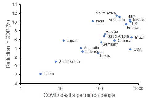
While I recognise that the social and economic impacts of the pandemic are multi-faceted, change in GDP for each country provides one measure of this. Let’s consider the G20 countries. We can compare the current per-capita death rate from COVID to the OECD’s forecast reduction in GDP for each country in 2020. That relationship indicates (somewhat crudely) what might have happened to Australia’s economy in the presence of more deaths (which would occur with laxer restrictions).
OECD forecast percentage reduction in GDP for 2020 compared to per capita death rate from COVID (log-scale) for G20 countries (as at 25 September 2020).
Contrary to the view that saving lives via restrictions reduces economic outcomes, COVID death rates are positively correlated with economic harm. The G20 countries with lower COVID death rates have experienced a smaller reduction in GDP than those countries with more deaths. While this is merely correlative, these data show that had we implemented softer restrictions, Australia could have had worse economic outcomes – the issue is the degree to which the disease (rather than the restrictions) harms the economy.
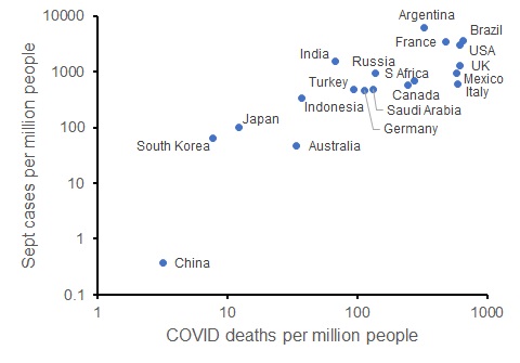
We can also look at the trajectory of the disease in each of these countries: the number of new cases per capita so far in September (up to 25 Sept) also correlates with the current COVID death rate. So those countries that have limited COVID deaths are on track to have fewer new COVID cases (and likely fewer deaths in the future, and potentially better economic conditions).
New COVID cases in September 2020 per capita compared to COVID deaths per capita for G20 countries (as at 25 September 2020; both axes on log scales).
The COVID pandemic still has months to run; in the absence of a vaccine, it will be many months. But so far, countries have had more than 100-fold differences in per-capita deaths from the disease and quite different economic impacts. All countries have imposed various restrictions. The comparatively onerous restrictions in Australia have likely saved up to 14,000 lives when compared to the worst-hit G20 countries. And the OECD forecasts that the economic impact on GDP will comparable or better in Australia than most other G20 countries.
Clearly, Australia’s economic and health outcomes would have been better without Victoria’s spike in cases that originated from a breach of hotel quarantine. However, once the breach had occurred and cases were increasing rapidly from June, Victoria’s subsequent lockdown reduced the number of deaths and long-term illnesses that would have otherwise occurred.
Consider Arizona, a US state with a similar population size to Victoria. Arizona had a large spike in cases that peaked in early July at around 4000 cases per day, forcing the implementation of more restrictions. With about 10 times as many infections as Victoria, Arizona has also experienced about 10 times as many COVID deaths.
Now with around 500 cases per day in Arizona (close to Victoria’s peak in early August), they have recorded infections in about 3% of the population compared to Victoria’s 0.3%. With the vast majority of the both populations yet to be infected, the number of cases and deaths could rise substantially in both states in the absence of control measures. But cases in Arizona remain high – much higher than in Victoria, and the health (and economic) prospects seem much worse in Arizona than Victoria.
We are seeing alarming increases in new cases across much of Europe since the start of July, an indication of what can happen if the disease is not controlled: exponential growth. The feature of exponential growth is that cases accelerate rapidly from seemingly low levels. These other locations provide the counterfactual of what happens to the number of cases if COVID is not controlled. Counterfactuals for the economic impacts suggest that controlling the disease can also lead to better economic impacts, something that a range of economists predicted at the start of the epidemic.
The next time someone muses about whether controlling COVID is worse than the disease, I sincerely hope that they make a decent fist of trying to answer that question. Because when I look at the evidence, the answer seems to be a resounding “no”.
————————————————-
* I am not going to link to the article – it really seems to be click bait.
** I have about 20 meetings already in the calendar for next week, which could be worse now that the bulk of my teaching has just finished for the year. And while I might moan, virtual meetings are so much better than no interactions.
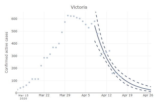
The relatively slow decline in active Australian cases (see original post below) reflects some regional variation in the progression of the epidemic. For example, the number of active cases has increased in Tasmania. In Victoria, active cases have declined much faster than the national aggregate. If you head over to Ben Phillip’s COVID-19 forecaster and select Victoria, you will see that the number of cases has been halving ever 4-5 days. One gets a similar rate of decline if examining the number of new cases in Victoria when excluding imports (both new cases and the number of active cases should decline exponentially).
Number of active cases in Victoria with a fitted exponential curve (from au.covid19forecast.science.unimelb.edu.au). This rate of decline is substantially faster than for the aggregated Australian data.
With that trend, the expected number of active cases in Victoria will equal 0.5 by mid May. That is a little more encouraging than when examining the aggregated Australian data. The data for New South Wales is unreliable because the number of recoveries has not been updated consistently over time in the JHU data repository. However, rates of decline in some other Australian states and territories have been similar to Victoria (e.g., the number of active cases have halved in less than a week in the ACT and South Australia).
Original post
In Australia and a few other countries*, COVID-19 cases are declining. But where are we heading? Here I look at the data to answer that question.
In one of my previousposts, I mentioned that typical epidemiological model predict exponential growth in the early phases of an epidemic (in the absence of further importation of new cases and if the transmission rate remains constant). The previous posts aimed to investigate the degree to which transmission rates were changing in Australia (and elsewhere) as control measures were implemented.
Now that Australia has a relatively stable (and low) rate of transmission, we still expect the number of active cases to change exponentially but now it will be exponential decline because physical distancing is helping to control transmission of coronavirus.
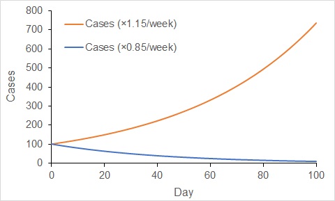
When cases increase exponentially, the rate of increase gets faster with time. In contrast, the rate of decline gets slower with time under exponential decline. Over the last week or so, the number of active cases in Australia has declined at a rate of about 15% per week. That is, the number of active cases now is about 85% of the number that existed one week ago.
If that rate of decline continues, then in two weeks we would expect the number of cases to decline to 85% × 85% = 73% of the number now. Over another two weeks (four weeks in total), we would expect the number of active cases to decline to 53% of the number now (85% × 85% × 85% × 85%). You will note how the rate of decline gets slower and slower.
Change in the number of cases when increasing exponentially at a rate of 15% per week (red), and when decreasing exponentially at 15% per week (blue). Increases accelerate, while decreases decelerate with exponential dynamics.
It takes about 19 weeks (almost 4.5 months – i.e., late August) to get the number of active cases to one twentieth of the number now with a decline rate of 15% per week. We currently have about 2600 cases in Australia, so this projection would suggest we will have about 130 cases by late August. That is approximately the number of cases that existed a little over a month ago.
This might seem a little disheartening. The increase in occurrence that we have seen in the virus in about a month (even with effective physical distancing for much of that time) will take almost 5 months to eliminate. This emphasises the difficulties faced when managing coronavirus in Australia.
Of course, we don’t have much data to estimate the long-term rate of decline in the number of active cases; the number of active cases in Australia has only been declining for a couple of weeks, so our estimate of the rate of decline is uncertain. It is possible the incidence of COVID-19 cases might decline faster than 15% per week. Or cases might decline less quickly.
Nevertheless, this analysis suggests to me (and as foreshadowed by the Federal and State Governments of Australia), that management of coronavirus in Australia (and elsewhere) is a long-term proposition.
In my previous post, I examined country-level trends in transmission rates of the coronavirus. Most of Australia’s cases have been imported from international arrivals (typically returning travellers). Notwithstanding some notable bloopers, controlling importation of coronavirus is relatively straightforward, especially with enforced quarantine of returning citizens and residents. Control of imported cases of COVID-19 are likely responsible for much of the decline in Australian infection rates seen in my previous post.
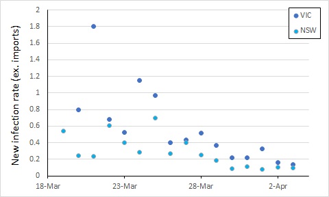
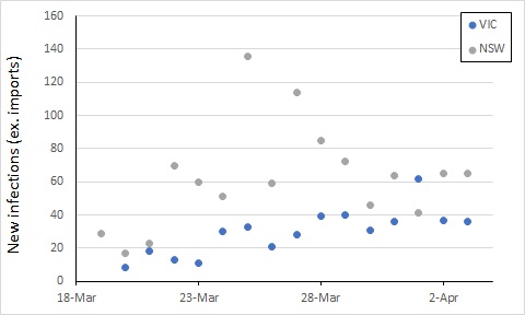
From here, control of COVID-19 in Australia will depend on limiting local transmission. The data from covid19data.com.au distinguishes between sources of infection, and also allows us to compare states. If we exclude international sources, and look at new infections, the local transmission rates appear to be declining in New South Wales and Victoria (Australia’s largest states with the most cases). In this, I again account for an incubation period by calculating the rate of new infections as a proportion of cases 5 days previously (excluding international sources, so the “under-investigation” cases are counted as local sources).
We see an apparent drop in local transmission around 26 March, and possibly a further one around 30 March. The drop around 26 March most likely reflects policy changes implemented from 16 March (no gatherings of more than 500 people).
The next major policy changes occurred on 19 March (indoor spaces with at most 1 person per 4 square metres), and 22 March (closure of restaurants, pubs, cafes, etc). The drop at around 30 March might reflect these changes, or it might simply be noise in the data.
Evidence of the impact of further restrictions (no more than two people together in public, 29 March) probably won’t be clear for at least another week or so.
Also, while the new infection rate has declined, the total number of cases has increased, such that the two roughly balance – the number of new cases per day has not been trending up or down over the last week, albeit with some variation.
To get on top of the epidemic, this number of new cases would ideally decline over the next week or two. Let’s keep an eye on it.
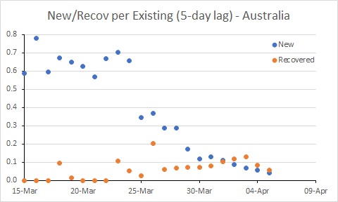
New data on recoveries for Australia – we now have more recoveries than new cases.
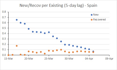
Spain’s rate of new infections is almost below the rate of recoveries.
Update 4 April (latest graphs):
Note: There was an error in the calculation of recovery rates. This is fixed in this latest update (the original post retains the errors).
USA remains a major worry, with the new infection rate remaining well above 0.2; this probably needs to be needs to be well below 0.1 for the number of existing cases to decline. There are further good signs in Australia. Spain is better than it was, but still a worry.
Original post:
You must be tired of exponential trajectories of COVID-19 by now. Well, this blog post isn’t about that directly, but it addresses the same topic – the trajectory of COVID-19. But I hope this is a little more useful for illustrating progress (or lack thereof) in managing the epidemic in each country.
The exponential trajectory of the number of cases is useful as a point of comparison. It shows what would happen in the early stages of a COVID-19 epidemic with only local transmission at a constant rate per infected person (ignoring importation, no controls on spread, and with even mixing of people in a population). We could compare an observed trajectory with that, and hope to see the “curve flattening”. This is the basis of Ben Phillips’ “coronavirus forecaster“.
However, spotting small bends in exponential curves is difficult to do by eye – is that ever-increasing curve starting to flatten? Further, the data that typically get plotted are the number of existing cases, the growth of which includes new cases minus recoveries.
A useful approach is to examine the new cases each day. For COVID-19, the number of local transmissions should be proportional to the number of infected people (in the early stages of the epidemic, when the vast majority of people are still susceptible). It is this proportionality that leads to the expected exponential growth (when the ratio of new to infected cases remains constant).
Further, given an incubation period of five days (roughly that of COVID-19), the number of new cases should be proportional to the number of cases that existed five days ago. In this situation, the ratio of new cases to existing cases from five days ago is the key parameter. I will call this ratio the “rate of new cases”. If we look at that rate, you can get a better picture of the trajectory of the epidemic.
In an epidemic, there will be new cases each day until the disease is almost eradicated. Progress in controlling the disease will be seen by reducing the number of new cases until they are fewer than the number of recovering cases. Therefore, a useful benchmark for assessing new cases is the number of recovering cases per day. To make the number of recovering cases comparable to new cases, we should also scale recoveries by the same factor – the number of existing cases from five days ago.
So, what do these figures look like for some countries?
Australia’s rate of new cases (per existing case) reduced noticeably around 25 March. But more work needs to be done to get the rate of new cases below the rate of recoveries. In South Korea, for example, where the number of existing cases is declining, the rate of new cases is below 0.05. Australia is a long way from that at the moment.
A reduced rate of new cases will arise from changes in behaviour of people and control of importation through measures such as physical distancing and quarantining recent arrivals. Responses in the data will lag these initiatives, with the lag corresponding to the incubation period (about 5 days for COVID-19) plus the time it takes to process tests (which varies from less than a day to several days).
Progressively more aggressive approaches to controlling importation and spread of COVID-19 commenced in Australia from 15 March. It seems likely that the reduction in the rate of infection around 25 March reflects those actions.
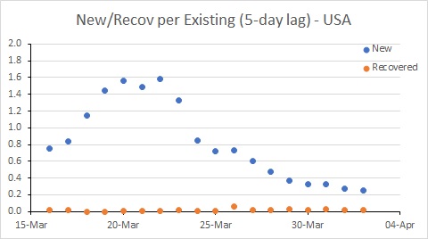
The USA is in a worse position than Australia. While the rate of new cases has declined, it remains much higher than the recovery rate, and much higher than Australia’s rate. This suggests the epidemic in the USA will continue to worsen for some time yet.
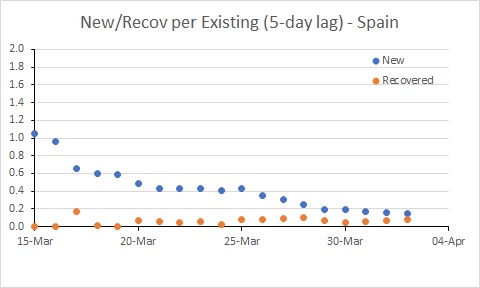
The situation in Spain has improved, but it is still bad. The rate of new infections has dipped to be similar to Australia, but with many more existing cases, the number of new cases per day remains extremely high (and much higher than in Australia).
This analysis has a few idiosyncrasies. Ideally it would distinguish between local transmissions and importation – the former is much more of a worry if importation can be controlled. However, the daily data I used (from the Wikipedia pages of each country, in case you are interested) only publishes total cases.
Secondly, the analysis doesn’t account for undetected cases. If the proportion of undetected cases remains constant, then this isn’t a problem when calculating the rates (the detection rates cancel when dividing). However, the spike in rates in the USA up until 20 March most likely reflects an increased rate of detection of cases through increased testing rather than an increase in transmission.
So this tells us the USA has hard times ahead, and further limits to transmission seem required to control the epidemic. The rate of infection in Spain and Australia has declined, and it will be interesting to see the extent to which these rates decline further in response to the measures put in place by governments (and hopefully followed by their citizens – people, it’s not time to go to the beach!!!)
But in all three countries examined, the trajectory of the epidemic is clearly still increasing. Please stay at home as much as possible.
Edit: I also did a separate analysis for California and NY State. The big increase in the rate of new infection in NY State is probably a testing artifact. Rates in both states need to reduce substantially.


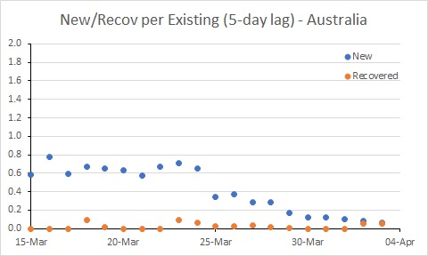
 Australia’s rate of new cases (per existing case) reduced noticeably around 25 March. But more work needs to be done to get the rate of new cases below the rate of recoveries. In South Korea, for example, where the number of existing cases is declining, the rate of new cases is below 0.05. Australia is a long way from that at the moment.
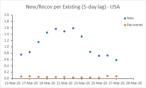 The USA is in a worse position than Australia. While the rate of new cases has declined, it remains much higher than the recovery rate, and much higher than Australia’s rate. This suggests the epidemic in the USA will continue to worsen for some time yet.
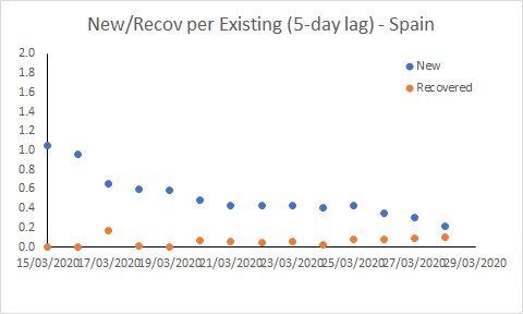 The situation in Spain has improved, but it is still bad. The rate of new infections has dipped to be similar to Australia, but with many more existing cases, the number of new cases per day remains extremely high (and much higher than in Australia).
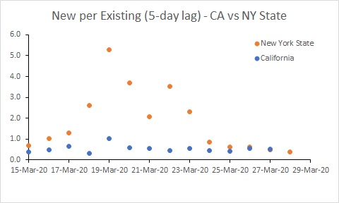


You must be logged in to post a comment.